For this project, the 8th graders were asked to research his art and then make a work of art that was inspired by him.
Tuesday, October 22, 2013
8th Grade Studies Jan Hendrix
Jan Hendrix, a Holland-born artist, was the inspiration behind the 8th graders most recent work. Jan's artwork (click his name to visit his website) is heavily influenced by nature and features a beautiful, simple, and modern aesthetic. With his art, he explores printmaking, glass work, enamels, metal, painting, and more.
For this project, the 8th graders were asked to research his art and then make a work of art that was inspired by him.
For this project, the 8th graders were asked to research his art and then make a work of art that was inspired by him.
Monday, October 21, 2013
6th Grade Vases
The 6th grade learned about value (dark and light) and how to use it to make something look three-dimensional. We also learned how to apply (the illusion of ) light and shadow to make our art look more realistic. For this project, students each drew three striped vases. The stripes transition from dark to light in order to show shape and shadow. Then, student chose their best two vases, cut them out, and pasted them down on a large piece of back and white paper.
This lesson was taken from Arte a Scoula's fabulous art blog. Thank you!
Wednesday, October 9, 2013
Stencils/Stained Glass
Using X-Acto blades, the seventh graders created beautiful "stained glass" stencils. We did this twice -- the first time, students simply cut a symmetrical design. The second version was meant to tell a story. We decided upon storytelling because we learned that one of the original purposes of stained glass was to tell stories!
Below you can find a few beautiful examples of their work:
Below you can find a few beautiful examples of their work:
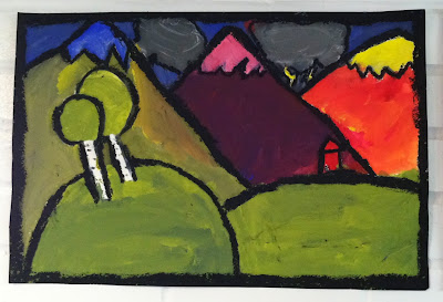
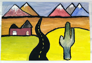
Kandinsky Landscapes
For this project, we also learned a lot about color. We talked about warm and cool colors, and also learned about color idioms ("I'm seeing red," "I'm feeling blue," etc.), why we use them, and why they make sense. Students then chose a mood to express with color. An eerie mood, for example, might require different color choices than a happy or excited mood.
Here are some of my students' beautiful, abstract landscapes.
PS: This project idea came from the wonderful art blog, Arte a Scoula.
Tuesday, October 8, 2013
8th Grade: Positive and Negative Space Designs
I was so impressed with the 8th graders ability to create dynamic, beautiful artwork out of a small square of paper. All of these projects started with a 6 x 6 inch piece of construction paper. The students then cut shapes out of the paper and glued them down outside the square, creating a wonderful interplay of positive and negative space.
Project 1: Reverse-Illuminated Letters
In an effort to get to know one another better, and as a fun way to explore pattern, design, as well as negative and positive space, our middle school art students reverse-illuminated the first letter of their first names. This means that instead of decorating the inside of their letter, they left their letter untouched, and instead created designs in the space around the letter.
Everyone did such a wonderful and creative job. It was also fun to create words by combining the letters together. Literacy! Yay!
Everyone did such a wonderful and creative job. It was also fun to create words by combining the letters together. Literacy! Yay!
Subscribe to:
Comments (Atom)


.JPG)


